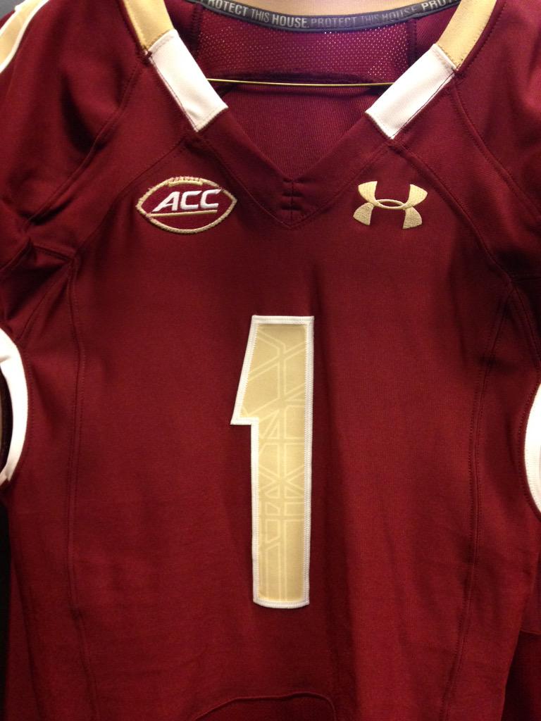
BC's Football Equipment Staff put this picture up on Twitter Thursday. While we cannot see everything, it is a pretty good look at what the 2015 uniform will look like. The stained-glass is still part of the numbers and the colors remain the same. The ACC Football logo is new. Since I cannot see the whole sleeve, I cannot tell if the piping at the base is different. The piping around the collar looks a little different. To my eye, it seems like the maroon part in the front is a little shorter. The white area seems about the same, but because the maroon seems shorter, also seems a little closer to the chest area.
The best part about the picture is that we are one step closer to the start of the season.


4 comments:
These uniforms have grown on me. I like the simplicity of them.
The only thing I would change (and from a marketing perspective I don't understand why UA hasn't done this) but add the BC logo to the neck/collar, similar to the Matt Ryan era Reebok uniforms, just to add something that says BC to what is a plain uniform and creates some kind of Idemtity.
I would love to see BC add the logo of the state of Mass as well somewhere on the uniform (maybe back neck like Tennessee did the last few years or have the outline of Mass around the ACC logo. Would be a cool way for the ACC to do their logo going forward, surround the ACC logo by each teams state outline).
i hope Under a Armour gets creative with something for the Fenway game. Maybe a throwback or something. Will be a platform for the program but also for UA to be creative.
Agreed, that these have grown on me over the last few years. I was not in love with the stained glass at first, and it seemed gimmicky, but you only notice it up close.
I like the idea of some sort of shout out to Massachusetts on the uniform, or even just to the city of Boston (the New England Revolution have the Bunker Hill Flag on their uniform, that would be tremendous). On the rowing team we would sometimes put "AMDG" somewhere on the uniform, which would be a nice touch.
I say keep the primary uniform consistent and plain. Use the Mass logo or anything else on the gimmicky marketing uniforms.
I'd just like to see the names on the back again.
Post a Comment