Showing posts with label Under Armour. Show all posts

Wednesday, August 03, 2016

Why is it so hard to get the uniforms right?

BC unveiled their new uniforms Wednesday (see embedded tweet below). The major changes are in the sleeves and in the pants. BC added stripes to the arms that include white and maroon against a gold base. The lines on the pants now curve in between the knees and thighs. None of this is objectionable, but it is all unnecessary. Do these changes excite anyone or do they just add more clutter to the jersey? The curved line on the pants have been around since the Broncos moved to them in the 1990s. Are we adopting them now to look current? I know this is about Under Armour and recruits, but there is a much simpler way to go about this.

BC should have a standard, classic base uniform for home and road games. Gold helmet with maroon stripe, gimmick free maroon jersey and simple gold pants. If you want to add a maroon stripe to the gold pants, I would not object. We've had various road styles over the years. My suggestion is to pick a simple one and stick with it.

Once you have your "base uniforms" established, then you get crazy with the rest of the season. Add wings or feathers to the helmet. Go all black. Use funky fonts and italics. Put lines all over it. Create a super fan style uniform. Use different shades of gold or maroon. Become the Oregon of the East. I don't care. Just as long as there is a simple, consistent BC to revert to for most of the season.

This new look to the sleeves and pants is not the worst we've had, but I am not a fan. Like all these uniform changes, this will get changed in a year or two. Hopefully soon BC will realize that the best way to appeal to old fans like me and young recruits is to get a uniform for every occassion instead of one look that leaves everyone so empty.


Friday, February 12, 2016

What next?


Chipotle costs us a win earlier this year. Maybe we can blame another corporation for our anemic offense in basketball? In case you missed it, Big Ten teams are complaining about Maryland's Under Armour brand basketballs. The visitors say the weight and feel are off and are more like a "street ball." BC, like all Under Armour schools, uses the same ball.

While I heard a few whispers about Under Armour shoes over the years, I have never heard anyone related to BC complaining about the basketballs. This all seems a bit whiny to me. If the schools really cared about consistency, they would adopt a universal ball. But that would leave too much money on the table.

I don't think the problem with BC Basketball is Under Armour, but we can add it to the excuse list.

Thursday, August 13, 2015

Throwbacks for Fenway!


As expected, BC will wear a special uniform for the game at Fenway. But instead of some nouveau "Cool" look, BC is going old school with a throwback look to the '80s. The color will be a little more mustard than our current gold. The helmet stripe is gone and the pants have the white-maroon-white trim.

But these are not truly identical to the Flutie days. We didn't have the "vintage" BC logo on the shoulder and the arm stripes are on the undershirt, not the true jersey. Plus in the '80s, the jerseys were very short, and guys like Flutie often had their abs showing.

Even if it is not a true throwback, I like what Under Armour did here. These should be popular and hopefully boost sales a bit.

By the way. The Irish will wear green. We know how that goes against us.

Thursday, July 16, 2015

Sneak peek at 2015 uniform


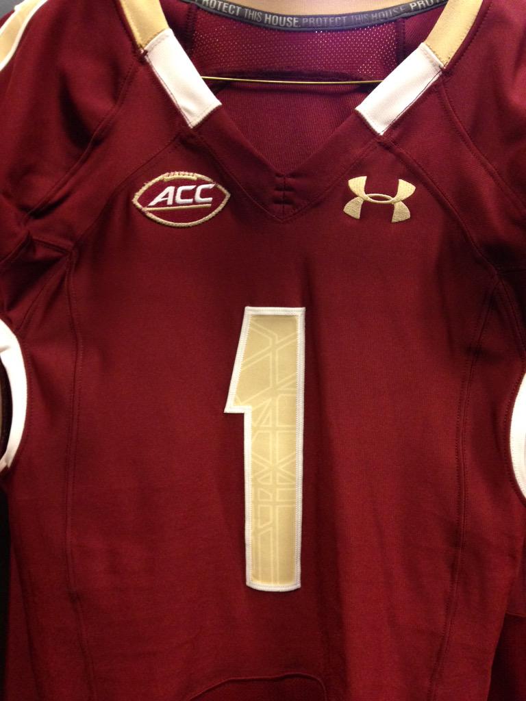
BC's Football Equipment Staff put this picture up on Twitter Thursday. While we cannot see everything, it is a pretty good look at what the 2015 uniform will look like. The stained-glass is still part of the numbers and the colors remain the same. The ACC Football logo is new. Since I cannot see the whole sleeve, I cannot tell if the piping at the base is different. The piping around the collar looks a little different. To my eye, it seems like the maroon part in the front is a little shorter. The white area seems about the same, but because the maroon seems shorter, also seems a little closer to the chest area.

The best part about the picture is that we are one step closer to the start of the season.

Thursday, March 12, 2015

Guessing the dollars of BC's Under Armour extension

BC and Under Armour extended their partnership another 10 years. This is good news for BC. Despite some early gripes in the first year with regards to feet problems with the shoes, overall I think both sides have been happy. Under Armour is still only supplying eight Power 5 schools, so BC still gets the attention we deserve. It still also adds a little coolness to recruits and fans. But as much as the marketing and recruiting is important, what really matters is the money.

Unfortunately for BC, it doesn't seem like our other potential partners in Adidas and Nike were writing blank checks for apparel deals. Under Armour just signed Notre Dame to the largest deal in college sports. It is estimated that the Irish got $100 million for 10 years. Nike even let Miami leave for Adidas for an estimated $4.5 million. If Under Armour didn't break the bank to sign Miami -- a traditionally a higher profile school than BC -- I don't think they were breaking the bank for BC's extension. The most lucrative UA deal right now is with Auburn and that is only a little over $4 million annually. Texas Tech renewed their UA deal recently and terms are not yet public. My guess is that because we renewed and agreed to a long deal, BC is probably getting around $3.5 and have some kickers if we raise our profile in the next ten years with some sort of basketball or football championship.

Now that the deal is done, I hope BC and Under Armour agree to some new looks and guidelines for the uniform. My preference remains a traditional, consistent conservative look for the majority of our games. I don't like tweaks year to year and especially tweaks during the season. Then in the one or two "marketing" games BC can go crazy. Try Super Fan yellow! Go with a winged helmet! I would even accept a full stain glass helmet for one game. Do throw backs from different eras.

BC's revenue from apparel is never going to be among the highest in college football. At this point that doesn't really matter. What matters is getting fair money with upside and having a partner who is focused on BC. This UA renewal does that.


Wednesday, September 10, 2014

BC unveils Red Bandanna uniforms

BC tweeted out a sneak preview of the Red Bandanna themed uniforms and gear the team will wear during the USC game. I am always leery of how BC incorporates Crowther's signature and story into the sports team, but I do think this looks cool. I haven't talked or emailed the Crowther family on this, but I assume they gave their blessing. I know players and Under Armour love doing this. Let's hope they remain reverent about the source and inspiration for the Red Bandanna.

Thursday, January 09, 2014

UMass still interested in Brown for something and other links

According to Blauds Don Brown remains a candidate at UMass for both the Head job and as a DC if Whipple gets the job. I am suspicious of all the speculation. Why would he leave BC (and presumably take a paycut) to go back to UMass as a coordinator? He was already head coach there. Would he want to work with Whipple that much? I am also doubtful that UMass would hire Brown for their head job. As much as our defense struggled this year, I don't want to scrap Brown's system after just one season. As we saw under Spaz, revolving coordinators doesn't lead to on the field success.

Under Armour signed Notre Dame to an apparel deal. It will be interesting to see how welcoming the Irish are to Under Armour's unique designs. I know the players don't care for the shoes, but as a fan I've been generally happy with the Under Armour BC uniforms. The only thing I hated was the white stripe helmet and that seems to be going away.

Charlie Davies signed with the Revolution.

This article doesn't mention BC, but it does deal with the growing issue of college basketball transfers. This new trend could help our next coach balance his roster fairly quickly. If anything having one mega class that didn't have much attrition hurt Donahue's ability to backfill with transfers.

Monday, March 25, 2013

ACC Helmet Hullaballoo

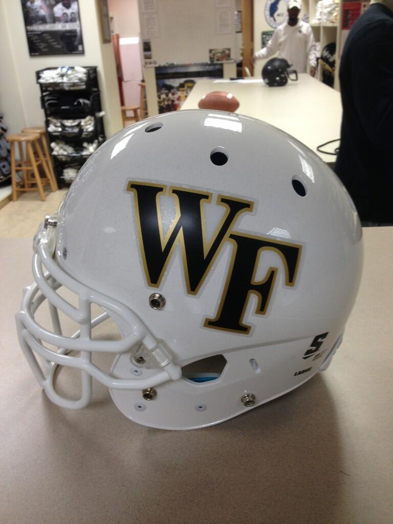
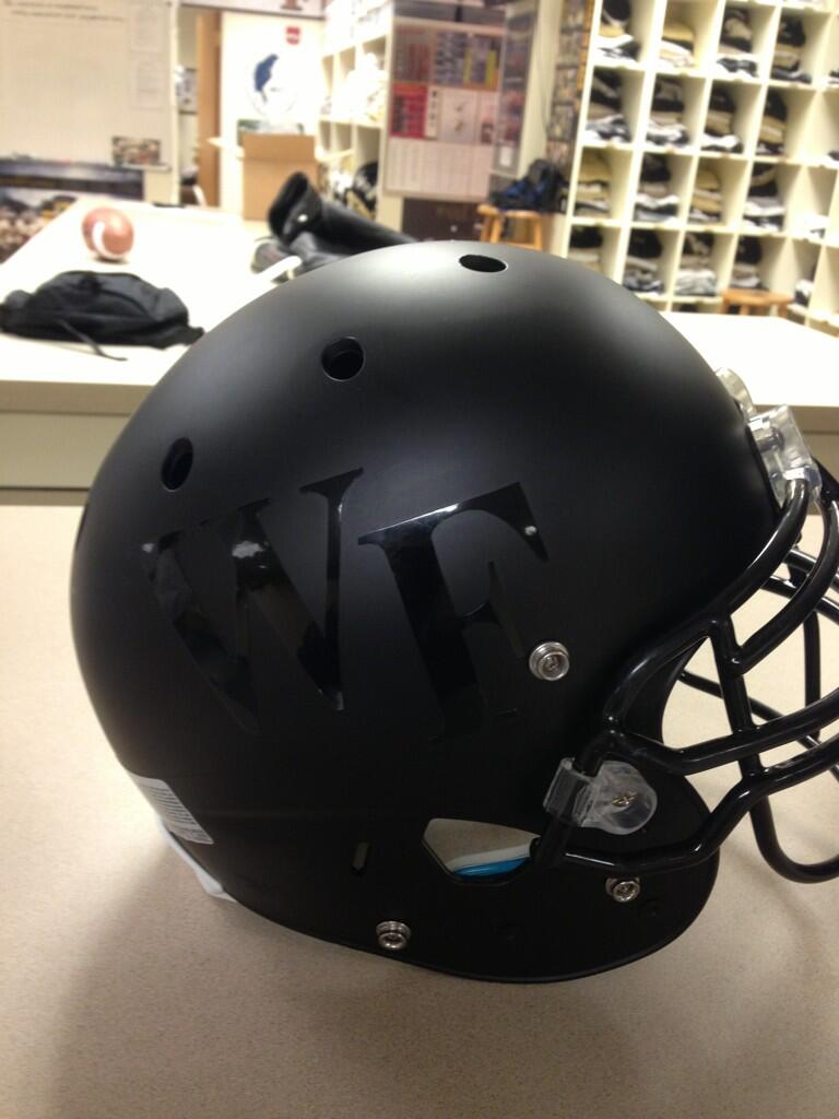
Take a look at Wake's new helmet. Nothing special, right? Fits in with their current style but adds a new dimension with the white base.

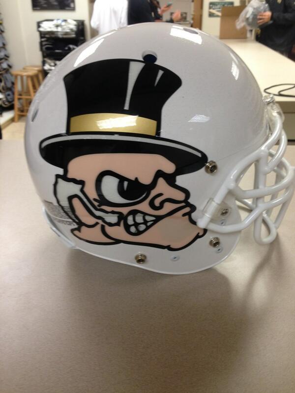
Now check out the other side.


Ugly. Tacky. Over the top. It is not Wake Forest, but it is the trend in college football. 

I've addressed the helmet and uniform issue millions of times, but if conservative Wake Forest can come out with a "cool" look, we can try something different and better than the white-stripe nonsense.

Wake will also use a matte look this season.


If all the cool kids are doing it, hopefully this gets BC one step closer to my "eagle wings" design.


Tuesday, October 23, 2012

Revisiting the Under Armour white stripe helmet

Brad Bates has a lot on his plate. As much as I like giving him unsolicited advice on the big issues, I want to use his second day on the job to address a trivial matter. We need to get rid of the white stripe/stained glass helmet! Firing Spaz may have to wait, but the helmet is something that can be rectified before the season is over.

The helmet may look cool. Who am I to judge taste and style? My idea of cool are BC whale pants. It may be a hit with players. If these gimmicks didn't work, Oregon wouldn't unveil a new helmet every week. Under Armour may like it because it reinforces our stained-glass motif. All of that doesn't matter. What matters is that we will forever associate that helmet and this look with Spaz's losing seasons. Since its debut BC has been in a tailspin. BCI dubbed the 49er knockoff the "Mendoza helmet" because our winning percentage with it on was less than .200. And we keep losing. Helmets don't win games but they do project an image. This helmet screams: "Spaz football."

I like the idea of uniform gimmicks. Do things like the Wounded Warrior Project. Try a Pro Combat look once a season. But week in and week out we need our guys wearing this.


This helmet may be plain. It is not the one Flutie wore, but it is distinct, it is ours. This says: "BC Football."

Tuesday, October 09, 2012

Real news and more rumors

Before I get to more AD speculation, this is some real news. BC will wear the following uniform October 27 vs Maryland. It is part of BC and Under Armour's efforts to support the Wounded Warrior project. Going back to what I wrote last week, if BC feels the need to depart from our normal uniform, I would like to see something like this: one off, with a purpose.  The players seem to like the idea too.


BC will play Georgia Tech at 3 pm on regional sports networks. 

Finally BC will have a press conference at 1:30 on Tuesday. No subject was given but you have to assume it is to introduce the new AD. Speculation is rampant that it is Boo Corrigan or Quentin Williams. At this point I won't say much about either until I know things are official.

Monday, October 01, 2012

Not going for the gold


I've had more than a day to think about it and I just don't care for the "gold" football jerseys. I don't hate them like I hate the white stripe helmet, but I didn't feel like the gold was very inspiring or worth the effort. Like others have said, they're not even gold. That's more of a khaki (which is appropriate for BC in a different way).

I know this is all about marketing and appealing to players, but I feel like any uniform variation or specialty should be a real departure from our regular look. And should only be a once a season occasion.

My solution:


  • Keep a base uniform combination of gold helmet, with a single maroon stripe. Wear maroon jerseys and gold pants at home. On the road wear white jerseys with maroon pants (the main road combo of the TOB era).
  • Once a season wear a "throwback" uniform. There are plenty of different eras to highlight. Most are pretty tasteful and keep some sort of maroon jersey, gold pants combination. For these games we should use an all gold helmet.
  • To keep Under Armour happy, have one "cool" look per season. In this case I've been an advocate of a major departure to our helmet. My preference is copying the Philadelphia Eagles look, but there are other good ideas out there. I just hate the white strip. For the "cool games" we should also go with a clear departure from our normal uniform look. All black or maybe all SuperFan yellow. Just not khaki.

Monday, September 10, 2012

Eagle Marketing Youtube Channel and other links

I wanted to take a moment to recognize the good content coming from BC's YouTube account "EagleMarketing." They are posting many interviews. The most recent was with Steve Donahue regarding the team's trip to Spain. Based on the views listed, not many of you watched it, but it is worth your time. Donahue emphasizes the growth of the team and how it will help as the develop here at BC.


Sinkovec x-rays came back negative, but what I found interesting is that BC contacted other Under Armour schools about shoe issues.

Another one of Doug Flutie's nephews is a rising quarterback in Natick. It will be interesting to see how and if BC recruits him.

We are at the bottom of the ACC Power Rankings.

Friday, August 17, 2012

Notre Dame using gimmick helmet, why can't BC?

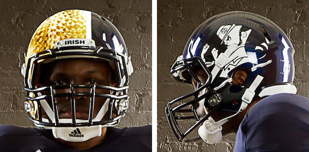
No team takes themselves more seriously than Notre Dame. If the Irish can allow their uniform to be altered like this for one game, why can't BC? Take a look at what Notre Dame will wear as a special look this fall.


I know we have the white stripe look, but I want to take it a step further. Let's do the wings helmet. The time has come!


Thursday, May 17, 2012

The future of BC's uniforms

While the rest of the ACC bloggers debate about FSU's departure, I am going to fret about another hypothetical. Grantland posted a great article on the future of corporate logos on sports uniforms. Logos are commonplace on sports jerseys around the world and in other sports (like NASCAR), but have not been a factor in the major, professional U.S. sports. Grantland predicts the NBA and NHL will have some variant soon. What the article did not broach was if college teams will add logos in the near future. My guess is they will and that raises many questions.

For anyone doubting that some college will eventually try the logo concept, all you need to do is look how willingly college teams embrace "combat" jerseys and other marketing ploys related to their uniforms. Is wearing some ridiculous contraption from Nike (or Under Armour) all that different from having a sports drink logo plastered on a shoulder of a uniform?

I doubt BC would ever be the first to try this idea, but we won't be the last. Once an few ACC teams or at least two of the Boston pro teams make the move you can count on BC to follow. This could be worth millions to the program. Aesthetically I wouldn't like it but I am sure I would get used to the idea. But what brands would we want to be associated with? Giant Glass and BMW of Peabody are great supporters of BC sports, but does that mean we have to have them out in front of the University's most public students?

Paying athletes also becomes an issue. It is hard enough to justify their amateur status now, but how can you when their uniforms become billboards? Schools could spin the endorsement: "those sponsors cover the cost of Title IX sports." The rebuttal is obviously that AT&T doesn't pay to be on the softball uniforms that no one sees.

College sports are changing. The money pouring in and the decisions being made will force schools like BC to readdress what our athletic mission truly is. I am not advocating that we become a Holy Cross. I still think athletics are a great tool and outlet for BC. But we need to start being more honest with ourselves and be prepared to answer the tough questions like should our students be walking ads for anything other than the school?

Tuesday, May 08, 2012

Under Armour overlooking BC in new t-shirt rollout

I hoped that when BC signed with Under Armour that it would mean more aggressive merchandising and licensing. Based on Under Armour's own website, BC is either old news or undesired.

Now these t-shirts aren't my tastes and BC's doesn't have the fanbases of some UA schools, but there is no reason they couldn't produce a BC version. UA is selling Loyola, USF, Temple and Marquette and not selling a BC version of this t-shirt. Why? Have BC sales been so poor that we are no longer part of design rollouts?

Because most of the college licensing products are made in batches, a manufacturer is taking a risk any time they make a bunch. But there is also a chicken and an egg element to the sales. How are they going to sell any BC gear if they don't make BC gear?

I love my BC Under Armour fleece and my BC Under Armour sweatshirt. But that doesn't excuse UA from leaving BC off of their own website. One of the reasons we selected Under Armour as our partner was so we would be one of their few colleges instead of one of many Nike schools. UA needs to promote and include BC in all of their releases and BC needs to stay on top of the relationship so that we are not ignored.

Saturday, August 13, 2011

The White Stripe


It's been a day since I saw the first picture of BC's new helmet. My initial reaction was was mild disappointment. I've progressed from there to full on hate.


How can a simple stripe (with stain glass effects) cause some much angst? Because it has no ties to our past, looks like another team, and finally just looks ugly.


When Tom Coughlin added the lone maroon stripe, there was similar head scratching. BC had always worn solid gold. Why change? I liked the first stripe. It was simple. Elegant. It also incorporated our two colors. Instead of complimenting the gold, the new three bar stripe distracts.


My second problem is how much the helmet looks like the 49ers. While that might seem hypocritical coming from someone who was advocating an Eagles-style helmet earlier this summer, there is a difference. My eagle wings idea was for a one-off occasion. This white stripe is permanent. And if we wore wings, we would still look different from the Eagles or Rice because of our color scheme. But our maroon looks enough like the 49ers red, that from a distance it will look very 49erish.


Finally, I just think it looks ugly. If you are going to take up that much space in the center of the helmet, I think you need a logo on the side. As it is, it looks like something is missing.


The Under Armour relationship has been great. I like the new uniforms and appreciate the willingness to give BC a distinct look. But this helmet is the first misstep. And based on how long it took to get rid of the italics numbers, I think we are stuck with the white stripe for at least a decade.

Sunday, July 24, 2011

ACC Media Kickoff Day 1

For those who weren't following on twitter, here is the ACC's roundup of Day 1 of the ACC Football Kickoff.

Both Montel Harris and Luke Kuechly scored big points with the assembled media. Neither seems concerned about individual awards.


For many fans, the biggest news of Day 1 was the debut of BC's new jerseys. Most pleasing is the return of normal numbers. The italics are gone! Let's hope we phased them out on our logo too.

(Screen grab courtesy of EO.)


With the ACC record within reach, Montel Harris is also getting national attention.


I am glad someone finally mentioned Kuechly's stats getting padded. I thought they might be too, but towards the end of the season, I started logging his specific tackles and they were pretty accurate.


HD and Pat Forde gave their take on Day 1.

Friday, July 01, 2011

Is EA Sports already using our new look?

EO poster Onyx Blackman had a nice find today with his screen caps of our uniforms in EA Sports. I am still waiting on confirmation from BC if all these looks will be used on the field. The big changes are the return of maroon pants and the gold home jersey. I welcome both additions. Other thoughts:

-- It looks like the "all white" era is over. I will always associate it with Jags's time at BC, so we might as well drop it.
-- A gold home jersey may be a reality. It is not as dramatic a departure as I was hoping for, but the gold jersey is perfect for a one-time event. I predict it will debut in our Thursday night game against Florida State.
-- It looks like we will have the stained glass numbers we saw in basketball. I don't know if anyone other than die-hard BC fans notice, but it is a nice touch.
-- This will be the first time BC plays in maroon pants with stripes. The maroon pants of the TOB era were solid.
-- The helmet stays the same.


Please share your thoughts. I will update as I get new information.


Monday, June 13, 2011

Wanted: BC's version of a gimmick uniform


Would you prefer a gold helmet with maroon wings or maroon helmet with gold wings?


Michigan and Notre Dame often take themselves way too seriously. Their traditions. Their history. What they will or won't do. Both consider their uniforms sacrosanct. Yet this season in their game against each other, they will debut special uniforms. They are calling them throwbacks, but Michigan's version is much more of a throwback/future clash. I used to hate this sort of overt marketing but now I am a convert. And I am also wondering if these two self important programs can mix it up a little, then why not BC?


BC last used throwbacks in 2004. The style recalled BC's uniforms of the mid-'80s. It was a nice touch but not exactly what I had in mind. I want BC to do something unique. Let's get Under Armour involved! I loved what they did with the basketball uniforms. Think of what they might do with a one time only event. A logo on the helmet? Wings?


I know BC fans tend to be traditional. I am not naive enough to think that one uniform will change our momentum on the field. It won't put butts in the seats. But it's something. There is tremendous apathy surrounding the program. It will take a numerous small steps to change that apathy. Changing our look for one game seems like a low risk way to shake things up.


Gene likes to say that BC tries to be Harvard during the week and Alabama on Saturdays. If we break out some gimmicky uniform, then we can say we are Harvard during the week and Oregon on Saturdays.

Tuesday, September 07, 2010

'Number' problem with new Under Armour jerseys

Question: Which BC player is that in the picture below?


It looks like 19, Isaac Johnson, but I couldn't tell and watched dozens of times on ESPN3.com trying to confirm [UPDATE: Reader John M. swears it was CJ Jones]. I wasn't the only one who had problems. This quote is from BC Athletic Director Gene DeFilippo:


Many fans have contacted us about the new football jerseys, and I agree that the numbers were very difficult to read. We have been in touch with Under Armour and we are doing everything we can to get them altered in time for Saturday’s Kent State game.


BC's italics numbers have always been hard on the eyes but UA's new piping on the numbers have made it nearly impossible to tell players apart. Not a great start for our new apparel partner. Let's hope things get fixed quickly or this could be a long season for anyone trying to ID a BC player in the stands or on TV.