Showing posts with label BC uniforms. Show all posts

Monday, December 03, 2018

Cbeckout these new basketball uniforms

I guess I should have been an Oregon fan, because I keep finding myself getting excited about uniforms. Look at what basketball is going to wear against Providence Tuesday.

These look cool, are not over the top and relate to BC's past. What's not to like? I want a classic and consistent look for all our sports, but appreciate that the occasional special uniform gets players and fans excited.

Tuesday, October 09, 2018

Throwbacks are back, now let us make the perfect uniform

As rumored, BC is breaking out the retro-'80s uniforms for the Louisville game. Before I nitpick a little, let me say that I love when they do this and I love the throwback look. We should do a throwback uniform once a season. However, this uniform is also a reminder of what still needs to be done. Here is my latest on how BC should plan their uniforms annually.

1. Always have a lone maroon stripe on the helmet. I know this is a relatively new aspect of BC Football (about 27 years), but I like the stripe. It differentiates us from other solid gold helmets and has been our thing long enough that it should be permanent.
2. Have one red bandana inspired uniform per year. This is another fairly new tradition, but a good one. Don't overuse it and make it the only time we wear white pants.
3. Have one "crazy" uniform look per year. I don't love this but recruits do. So let Under Armour go crazy. Put wings on the helmets. Go with wacky color schemes. Do whatever. But only do it once per year. Beyond a weird helmet or pattern, this is also the time where BC could experiment with long suggested ideas like the all SuperFan Yellow uniforms or even gray like basketball used this year.
4. Have one color of gold. This is my main complaint about the retro uniforms this weekend. The pants, the helmet and the shoulder stripes all look like different shades of gold. I prefer metallic gold to mustard, but BC needs to just pick one.
5. Create a new logo that is inspired by the classic BC logo. This retro logo is pretty darn close to what BC should wear. And based on fan reaction this is would be a popular move.
6. Regular home uniforms should look close to the early '90s look. Gold pants with solid maroon stripe. Maroon top with numbers on shoulders and Eagle or BC logo on the sleeve.
7. Road uniforms should be white jersey with maroon pants. Think of the mid-TOB era. No more all-white road uniforms.

Wednesday, August 03, 2016

Why is it so hard to get the uniforms right?

BC unveiled their new uniforms Wednesday (see embedded tweet below). The major changes are in the sleeves and in the pants. BC added stripes to the arms that include white and maroon against a gold base. The lines on the pants now curve in between the knees and thighs. None of this is objectionable, but it is all unnecessary. Do these changes excite anyone or do they just add more clutter to the jersey? The curved line on the pants have been around since the Broncos moved to them in the 1990s. Are we adopting them now to look current? I know this is about Under Armour and recruits, but there is a much simpler way to go about this.

BC should have a standard, classic base uniform for home and road games. Gold helmet with maroon stripe, gimmick free maroon jersey and simple gold pants. If you want to add a maroon stripe to the gold pants, I would not object. We've had various road styles over the years. My suggestion is to pick a simple one and stick with it.

Once you have your "base uniforms" established, then you get crazy with the rest of the season. Add wings or feathers to the helmet. Go all black. Use funky fonts and italics. Put lines all over it. Create a super fan style uniform. Use different shades of gold or maroon. Become the Oregon of the East. I don't care. Just as long as there is a simple, consistent BC to revert to for most of the season.

This new look to the sleeves and pants is not the worst we've had, but I am not a fan. Like all these uniform changes, this will get changed in a year or two. Hopefully soon BC will realize that the best way to appeal to old fans like me and young recruits is to get a uniform for every occassion instead of one look that leaves everyone so empty.


Thursday, August 13, 2015

Throwbacks for Fenway!


As expected, BC will wear a special uniform for the game at Fenway. But instead of some nouveau "Cool" look, BC is going old school with a throwback look to the '80s. The color will be a little more mustard than our current gold. The helmet stripe is gone and the pants have the white-maroon-white trim.

But these are not truly identical to the Flutie days. We didn't have the "vintage" BC logo on the shoulder and the arm stripes are on the undershirt, not the true jersey. Plus in the '80s, the jerseys were very short, and guys like Flutie often had their abs showing.

Even if it is not a true throwback, I like what Under Armour did here. These should be popular and hopefully boost sales a bit.

By the way. The Irish will wear green. We know how that goes against us.

Thursday, July 16, 2015

Sneak peek at 2015 uniform


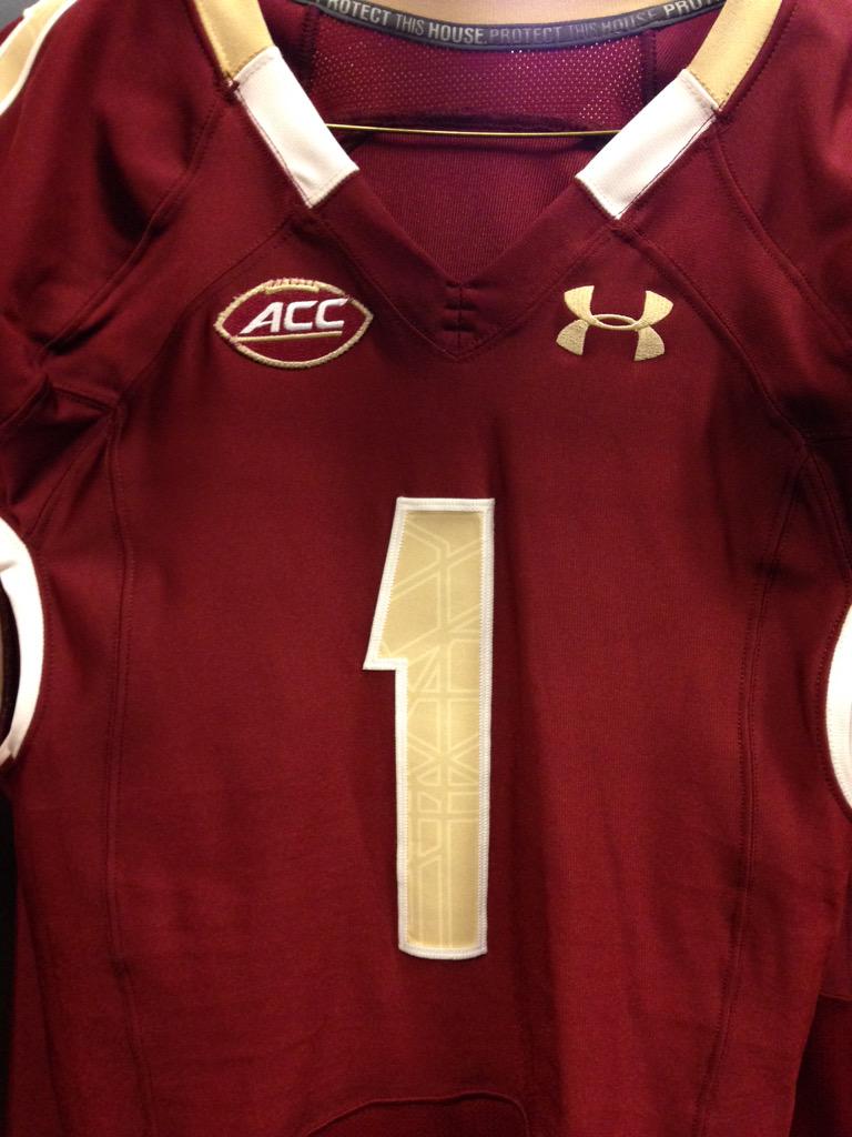
BC's Football Equipment Staff put this picture up on Twitter Thursday. While we cannot see everything, it is a pretty good look at what the 2015 uniform will look like. The stained-glass is still part of the numbers and the colors remain the same. The ACC Football logo is new. Since I cannot see the whole sleeve, I cannot tell if the piping at the base is different. The piping around the collar looks a little different. To my eye, it seems like the maroon part in the front is a little shorter. The white area seems about the same, but because the maroon seems shorter, also seems a little closer to the chest area.

The best part about the picture is that we are one step closer to the start of the season.

Wednesday, June 24, 2015

Answering email: names on uniforms

I try to answer all the emails sent to me. Sometimes the topic merits opening the discussion up to the larger BC fanbase. Here is an email from David H. and my response.
Question for ya -- do you think that player names should go back on the football jerseys? I believe that Spaz took them off, and Addazio has just kept the status quo.

I really wish they would put the player names back on. Makes it a lot easier to follow the team during the game and get excited about individual players. Not easy to remember all the numbers out there. I also think that the players and maybe even families might feel more proud with their family name on the uniform.

Wondering if there's any sort of movement or vocal group that feels the same way?


I would welcome a return of names on the back of the jerseys. Let’s be practical about the whole thing. It is not like we are preserving some history or tradition. The names have been coming on and off BC jerseys for five decades now. Sometimes we have them on the road but not home. Some coaches have mixed it up (TOB had it both ways). Even if you use the names (or lack thereof) as a motivational tool and a form of team unity, does that really make a difference?

Addazio is a big believer in motivational tools, so I don’t expect any change in the policy any time soon. Maybe if he hears enough negative feedback from recruits, he might change things.

The other factor that might help get names back is Under Armour. They are always looking to tweak the look and jerseys so adding the names back could be an upcoming recommendation. At least we no longer have the italics numbers, which made identifying players strictly by number very confusing.

My prediction is that names will return to home jerseys within two years. Addazio or Under Armour will make the change for sake of change.

Thursday, March 12, 2015

Guessing the dollars of BC's Under Armour extension

BC and Under Armour extended their partnership another 10 years. This is good news for BC. Despite some early gripes in the first year with regards to feet problems with the shoes, overall I think both sides have been happy. Under Armour is still only supplying eight Power 5 schools, so BC still gets the attention we deserve. It still also adds a little coolness to recruits and fans. But as much as the marketing and recruiting is important, what really matters is the money.

Unfortunately for BC, it doesn't seem like our other potential partners in Adidas and Nike were writing blank checks for apparel deals. Under Armour just signed Notre Dame to the largest deal in college sports. It is estimated that the Irish got $100 million for 10 years. Nike even let Miami leave for Adidas for an estimated $4.5 million. If Under Armour didn't break the bank to sign Miami -- a traditionally a higher profile school than BC -- I don't think they were breaking the bank for BC's extension. The most lucrative UA deal right now is with Auburn and that is only a little over $4 million annually. Texas Tech renewed their UA deal recently and terms are not yet public. My guess is that because we renewed and agreed to a long deal, BC is probably getting around $3.5 and have some kickers if we raise our profile in the next ten years with some sort of basketball or football championship.

Now that the deal is done, I hope BC and Under Armour agree to some new looks and guidelines for the uniform. My preference remains a traditional, consistent conservative look for the majority of our games. I don't like tweaks year to year and especially tweaks during the season. Then in the one or two "marketing" games BC can go crazy. Try Super Fan yellow! Go with a winged helmet! I would even accept a full stain glass helmet for one game. Do throw backs from different eras.

BC's revenue from apparel is never going to be among the highest in college football. At this point that doesn't really matter. What matters is getting fair money with upside and having a partner who is focused on BC. This UA renewal does that.


Friday, September 19, 2014

What Not to Wear


With the welcome news that BC will not use the Red Bandana uniforms again this season, the BC Twitterers and BC blogosphere went into overdrive about BC's current and future uniforms. Brian recapped the cross talk and outlined a basic plan I agree with, however, he didn't spend as much time on the "fashion don'ts" as I would have liked. Because if there is one person that BC should be taking fashion tips from, it is a blogger dad in his late 30s who wears about three different things and doesn't have to talk to recruits.

Rule No. 1: No more white pants
It is not even an after Labor Day rule. There is no historical justification for it and I closely associate it with the Gene DeFilippo era. Except for a designated special uniform day, our home pants should always be gold. No exception. On the road, I prefer the gold pants for historic reasons, but will accept the maroon pants (see Rule No. 3).

Rule No. 2: No white stripe helmet
I am okay with the stained glass effect (on a maroon stripe). I liked the wounded warrior helmets. I thought the red bandana helmets were appropriately subtle. I don't mind a solid gold helmet as a throwback. But all variations to the BC helmet should be under clearly defined specialty days. No random usage of the white stripe a.k.a. the 49ers helmet.
One could argue about the fun or early victories associated with the white pants. But the white stripe will always scream Spaz football to me. Do we want that kind of association? I know the history of the maroon stripe is not that old, but it is clean, classic and closely associated with BC Football. Embrace it and use it in most of our games.

Rule No. 3: No in-season variations to the road uniform scheme
My preference for all BC road games is a white jersey and gold pants. I can live with maroon pants. I never want to see the white pants again. But whatever BC does, I just want consistency. Pick a road uniform combo and stick with it for multiple seasons. When people flip on the channel, they should see the uniform and think "that's BC." Use the home games for the gimmicks. On the road you set a tone for the opponents and opposing fans. Establish a look and then go win a bunch of road games.

Monday, August 12, 2013

ACC W-L predictions and other links

Matt Hinton went team-by-team in the division to predict records. He settles on 5-7 for BC (which seems to be a growing consensus).

The players are saying the right things about taking the names off of the jerseys. I don't mind. I am sure it can and will change back in the future. We didn't have names on jerseys when I was a BC student.

The Heights puts some numbers behind our depth issues. It is not pretty.

Soaring to Glory took a look at our WRs.

ESPN put the spotlight on future Eagle Isaac Yiadom.


Monday, March 25, 2013

ACC Helmet Hullaballoo

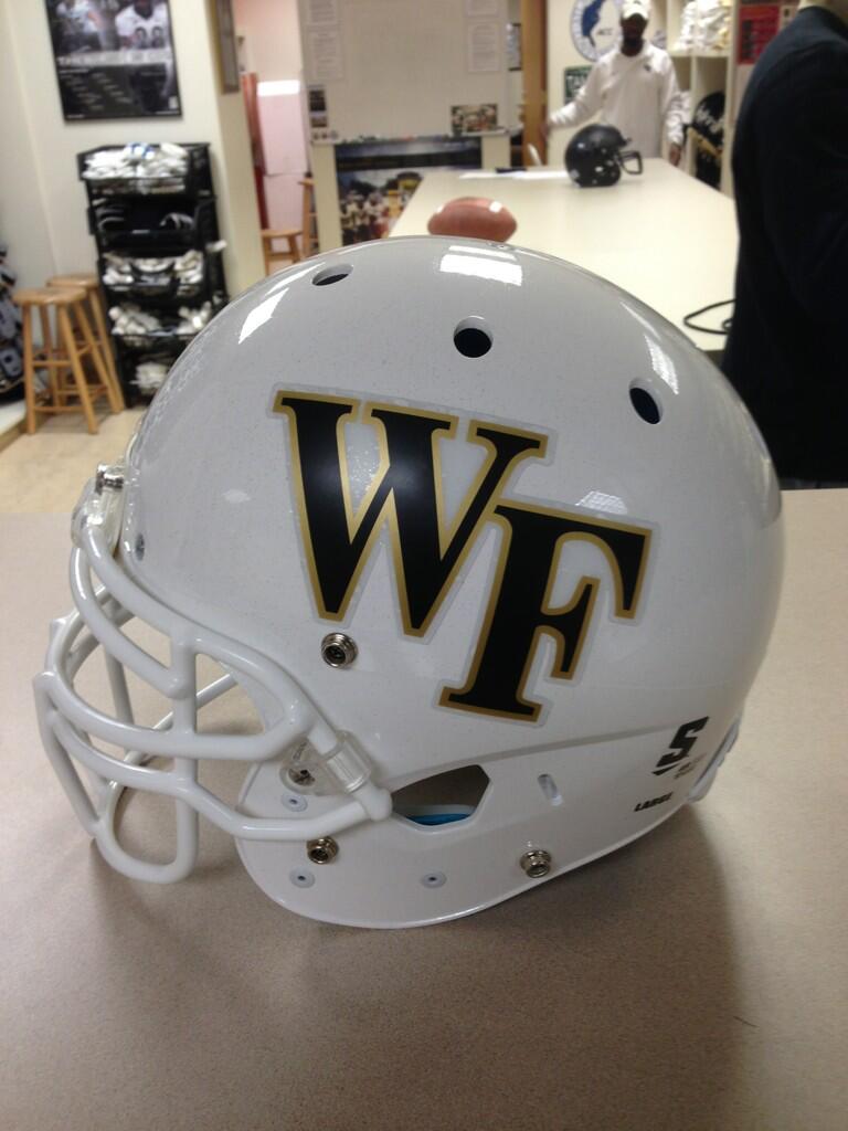
Take a look at Wake's new helmet. Nothing special, right? Fits in with their current style but adds a new dimension with the white base.

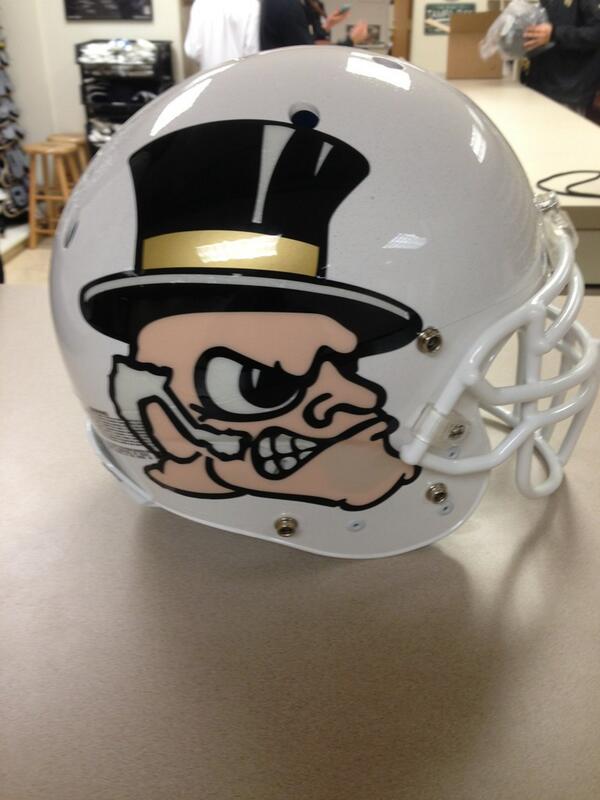
Now check out the other side.


Ugly. Tacky. Over the top. It is not Wake Forest, but it is the trend in college football. 

I've addressed the helmet and uniform issue millions of times, but if conservative Wake Forest can come out with a "cool" look, we can try something different and better than the white-stripe nonsense.

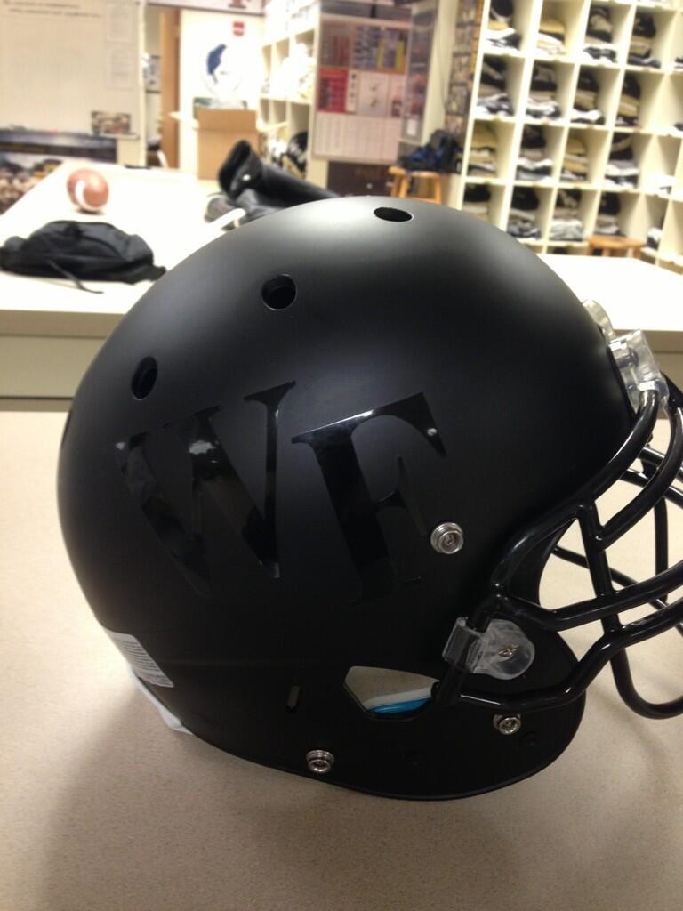
Wake will also use a matte look this season.


If all the cool kids are doing it, hopefully this gets BC one step closer to my "eagle wings" design.


Tuesday, October 09, 2012

Real news and more rumors

Before I get to more AD speculation, this is some real news. BC will wear the following uniform October 27 vs Maryland. It is part of BC and Under Armour's efforts to support the Wounded Warrior project. Going back to what I wrote last week, if BC feels the need to depart from our normal uniform, I would like to see something like this: one off, with a purpose.  The players seem to like the idea too.


BC will play Georgia Tech at 3 pm on regional sports networks. 

Finally BC will have a press conference at 1:30 on Tuesday. No subject was given but you have to assume it is to introduce the new AD. Speculation is rampant that it is Boo Corrigan or Quentin Williams. At this point I won't say much about either until I know things are official.

Monday, October 01, 2012

Not going for the gold


I've had more than a day to think about it and I just don't care for the "gold" football jerseys. I don't hate them like I hate the white stripe helmet, but I didn't feel like the gold was very inspiring or worth the effort. Like others have said, they're not even gold. That's more of a khaki (which is appropriate for BC in a different way).

I know this is all about marketing and appealing to players, but I feel like any uniform variation or specialty should be a real departure from our regular look. And should only be a once a season occasion.

My solution:


  • Keep a base uniform combination of gold helmet, with a single maroon stripe. Wear maroon jerseys and gold pants at home. On the road wear white jerseys with maroon pants (the main road combo of the TOB era).
  • Once a season wear a "throwback" uniform. There are plenty of different eras to highlight. Most are pretty tasteful and keep some sort of maroon jersey, gold pants combination. For these games we should use an all gold helmet.
  • To keep Under Armour happy, have one "cool" look per season. In this case I've been an advocate of a major departure to our helmet. My preference is copying the Philadelphia Eagles look, but there are other good ideas out there. I just hate the white strip. For the "cool games" we should also go with a clear departure from our normal uniform look. All black or maybe all SuperFan yellow. Just not khaki.

Friday, August 17, 2012

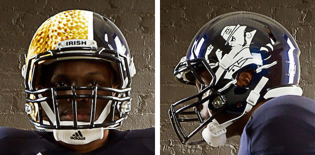
Notre Dame using gimmick helmet, why can't BC?

No team takes themselves more seriously than Notre Dame. If the Irish can allow their uniform to be altered like this for one game, why can't BC? Take a look at what Notre Dame will wear as a special look this fall.


I know we have the white stripe look, but I want to take it a step further. Let's do the wings helmet. The time has come!


Thursday, May 17, 2012

The future of BC's uniforms

While the rest of the ACC bloggers debate about FSU's departure, I am going to fret about another hypothetical. Grantland posted a great article on the future of corporate logos on sports uniforms. Logos are commonplace on sports jerseys around the world and in other sports (like NASCAR), but have not been a factor in the major, professional U.S. sports. Grantland predicts the NBA and NHL will have some variant soon. What the article did not broach was if college teams will add logos in the near future. My guess is they will and that raises many questions.

For anyone doubting that some college will eventually try the logo concept, all you need to do is look how willingly college teams embrace "combat" jerseys and other marketing ploys related to their uniforms. Is wearing some ridiculous contraption from Nike (or Under Armour) all that different from having a sports drink logo plastered on a shoulder of a uniform?

I doubt BC would ever be the first to try this idea, but we won't be the last. Once an few ACC teams or at least two of the Boston pro teams make the move you can count on BC to follow. This could be worth millions to the program. Aesthetically I wouldn't like it but I am sure I would get used to the idea. But what brands would we want to be associated with? Giant Glass and BMW of Peabody are great supporters of BC sports, but does that mean we have to have them out in front of the University's most public students?

Paying athletes also becomes an issue. It is hard enough to justify their amateur status now, but how can you when their uniforms become billboards? Schools could spin the endorsement: "those sponsors cover the cost of Title IX sports." The rebuttal is obviously that AT&T doesn't pay to be on the softball uniforms that no one sees.

College sports are changing. The money pouring in and the decisions being made will force schools like BC to readdress what our athletic mission truly is. I am not advocating that we become a Holy Cross. I still think athletics are a great tool and outlet for BC. But we need to start being more honest with ourselves and be prepared to answer the tough questions like should our students be walking ads for anything other than the school?

Saturday, August 13, 2011

The White Stripe


It's been a day since I saw the first picture of BC's new helmet. My initial reaction was was mild disappointment. I've progressed from there to full on hate.


How can a simple stripe (with stain glass effects) cause some much angst? Because it has no ties to our past, looks like another team, and finally just looks ugly.


When Tom Coughlin added the lone maroon stripe, there was similar head scratching. BC had always worn solid gold. Why change? I liked the first stripe. It was simple. Elegant. It also incorporated our two colors. Instead of complimenting the gold, the new three bar stripe distracts.


My second problem is how much the helmet looks like the 49ers. While that might seem hypocritical coming from someone who was advocating an Eagles-style helmet earlier this summer, there is a difference. My eagle wings idea was for a one-off occasion. This white stripe is permanent. And if we wore wings, we would still look different from the Eagles or Rice because of our color scheme. But our maroon looks enough like the 49ers red, that from a distance it will look very 49erish.


Finally, I just think it looks ugly. If you are going to take up that much space in the center of the helmet, I think you need a logo on the side. As it is, it looks like something is missing.


The Under Armour relationship has been great. I like the new uniforms and appreciate the willingness to give BC a distinct look. But this helmet is the first misstep. And based on how long it took to get rid of the italics numbers, I think we are stuck with the white stripe for at least a decade.